Neufin case study cover — clean power financed without friction

Neufin

PROJECT FOCUS

branding / identity system / device design

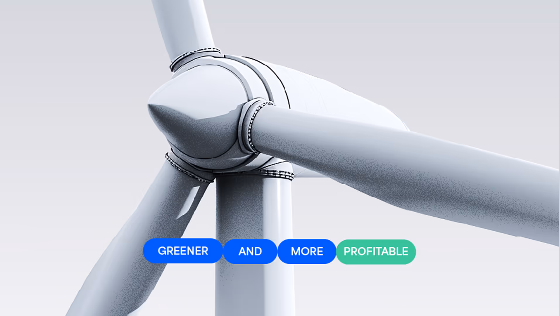
Neufin // clean power, financed without friction.
Brand build
positioning
socials

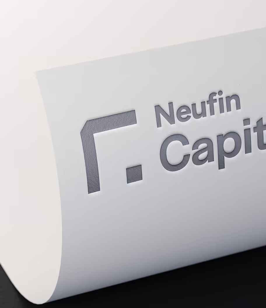
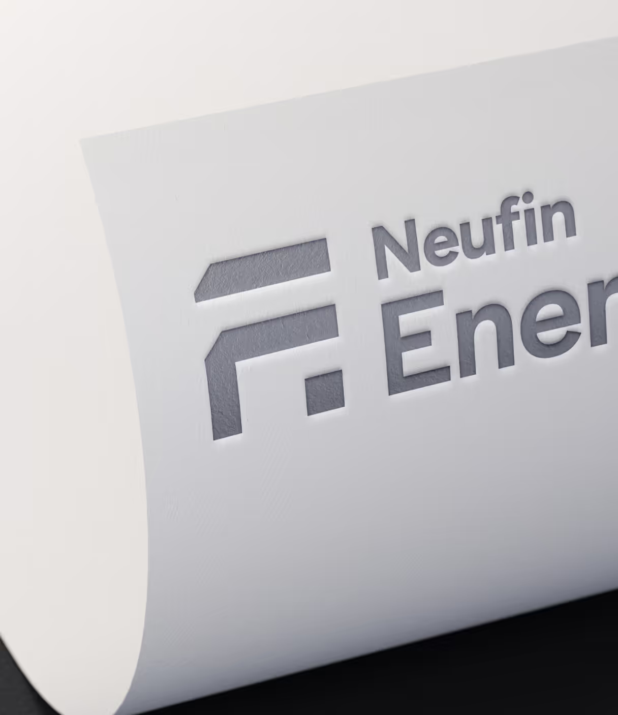
Neufin is building the infrastructure for climate finance, from real-time emissions tracking to offset trading. our brief was to extend Neufin Capital into a new vertical, Neufin Energy, with clear separation yet a unified brand language

Abstract white geometric shape composed of right angles and a small square on a dark blue grid background.
Abstract geometric design of a white angular shape resembling the letter 'G' on a dark blue grid background.
Color palette with six blocks labeled with HEX codes and color names: Energetic Green (#70D1A1), Progressive Green (#BCFDE5), Simple Blue (#0059FF), Neufin Blue (#0E1E40), Solar Yellow (#FBC026), and Reliable White (#FFFFFF).
Close-up of a white paper with a cutout logo and text reading 'Neufin Capital' on a dark background.
Embossed Neufin Energy logo on white textured paper.
Blue business cards with yellow and white Neufin Energy logo scattered on a dark blue background.
What we’ve built
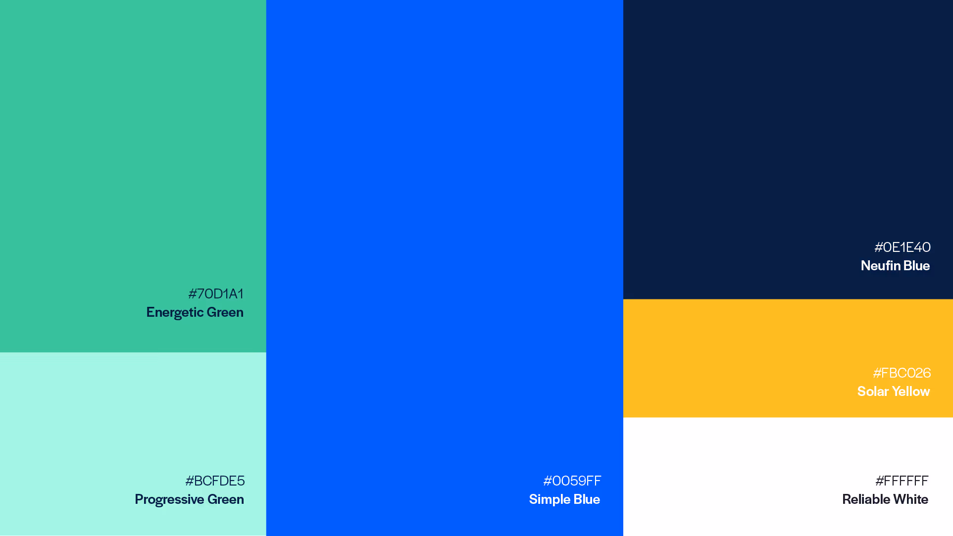
  • A parent/child identity system with shared DNA, tuned by color, texture, and form
  • A cohesive visual world that stays unmistakably Neufin across audiences
  • The circuit, a physical brand device for client recognition and BD momentum
Text on dark blue background reads 'to simplify access to renewable energy' with yellow highlights stating 'Save Cost', 'Save Time', and 'Neufin Energy', with Neufin Energy logo in top right.
Text on blue and dark background reading 'Our energy solutions stand out to meet your unique business needs' with a glowing blue sphere above.
Highlights
  • Brand separation without dissonance, one system, two verticals
  • “The Circuit” as presence, recognition, and business development tool in client spaces
Smartphone displaying a blue screen with text about simplifying the transition to clean energy and an abstract architectural image.